The work
Unica Formo is one person. Jordin designs custom websites for therapists, dietitians, coaches, doulas and other wellness and creative practitioners, and she runs every stage herself: the strategy, the design, the revisions, the launch.
Her clients are not designers. They are people who are excellent at their own work and have opinions about their website that they do not necessarily have the vocabulary for. That gap is where the project time goes.
The problem
Feedback arrived as email. PDFs, screenshots and live preview links going back and forth, with revisions reconstructed from whatever came back. It was confusing on both sides, hers and the client's.
A client would reference something and Jordin would have to work out which section, which page. Then she would go digging through a hundred emails to find the one specific comment she needed. There was no structure to any of it, and the cost was not the revision, it was everything before the revision.
Sometimes the guess was simply wrong.
Sometimes I'd make the wrong change simply because we weren't looking at the same thing.
What changed
She heard about BugSmash from another designer. The entry price made it worth taking a chance on before she knew whether it would fit her workflow, and she found the pricing genuinely competitive against the other options she had looked at. It was still in beta then, which she liked: she could give feedback and help shape the platform while she used it.
She was up and running immediately, with a couple of kinks worked out the same day. What sold her on it for client work was something she did not have to build:
The moment it was obvious
The recurring one is a client wanting a very specific change to an image, a section or an element. In the old process that meant an explanation over email and a round of guessing, sometimes ending in the wrong change because the two of them were not looking at the same thing.
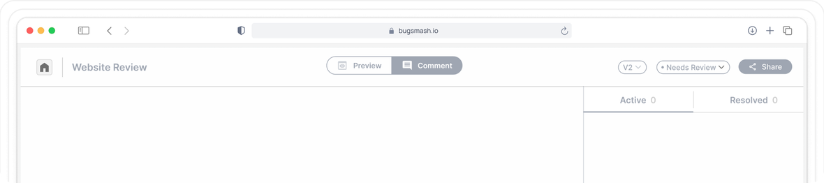
Now the client clicks the part of the site they mean, leaves the comment there, and uploads the image they want used. No guessing, no digging, no ambiguity about what is being referred to. She noticed the difference the first time she ran a client through it.
The result
Jordin estimates BugSmash saves 8 to 10 hours on every project . Almost all of it is the back and forth over email, trying to understand and clarify the small details a client is trying to describe. Visual feedback removes the clarification step rather than speeding it up.
It is worth being precise about what it replaced, because she was: nothing. She was prepared to invest in a much more expensive tool that would have done something similar. BugSmash did not displace a line item, it prevented a much larger one.
It now runs on 100% of her website design clients, from the initial draft all the way through to launch, and she uses it every day.
What it changed beyond the hours
Jordin already had a lot of process in place, and clients tell her so. What BugSmash added is a clear and professional way for a client to give feedback, and a way for her to keep revisions organised on her own side, which is a large part of why the process feels the way it does from the outside.
Her own framing is the one worth ending on. It is not a feedback tool she opens occasionally. It is a stage of the client process.
BugSmash isn't just a tool I use for collecting feedback. It has become a core part of my entire client process.
BugSmash has completely changed the way I handle client feedback. It saves me hours on every project, keeps everything organized, and eliminates so much of the back-and-forth that used to happen over email. I will never be able to go back to my old revision process.
Who she would tell
Any web designer or web design team that regularly goes through rounds of client feedback and revisions, and especially anyone still relying on emails, screenshots and PDFs to collect it.
The reason she gives for staying is the same one she gives for recommending it: how simple it is for the client to understand. On a solo studio that is not a nice to have. Every minute a client spends confused by the tool is a minute the designer spends explaining it.
Case study prepared with Jordin Brinn, Owner of Unica Formo. Published with her permission.